Creating Engaging UIButtons for iOS Development
Written on
Chapter 1: Introduction to Custom UIButtons
In my journey as a beginner iOS developer, I compiled various methods for crafting unique buttons, serving as a personal reference. This project encompasses multiple techniques, utilizing various classes and extensions to create distinct button styles. While I can't claim ownership of all the code, I will provide proper credit wherever due. The complete project is accessible on GitHub, linked below.
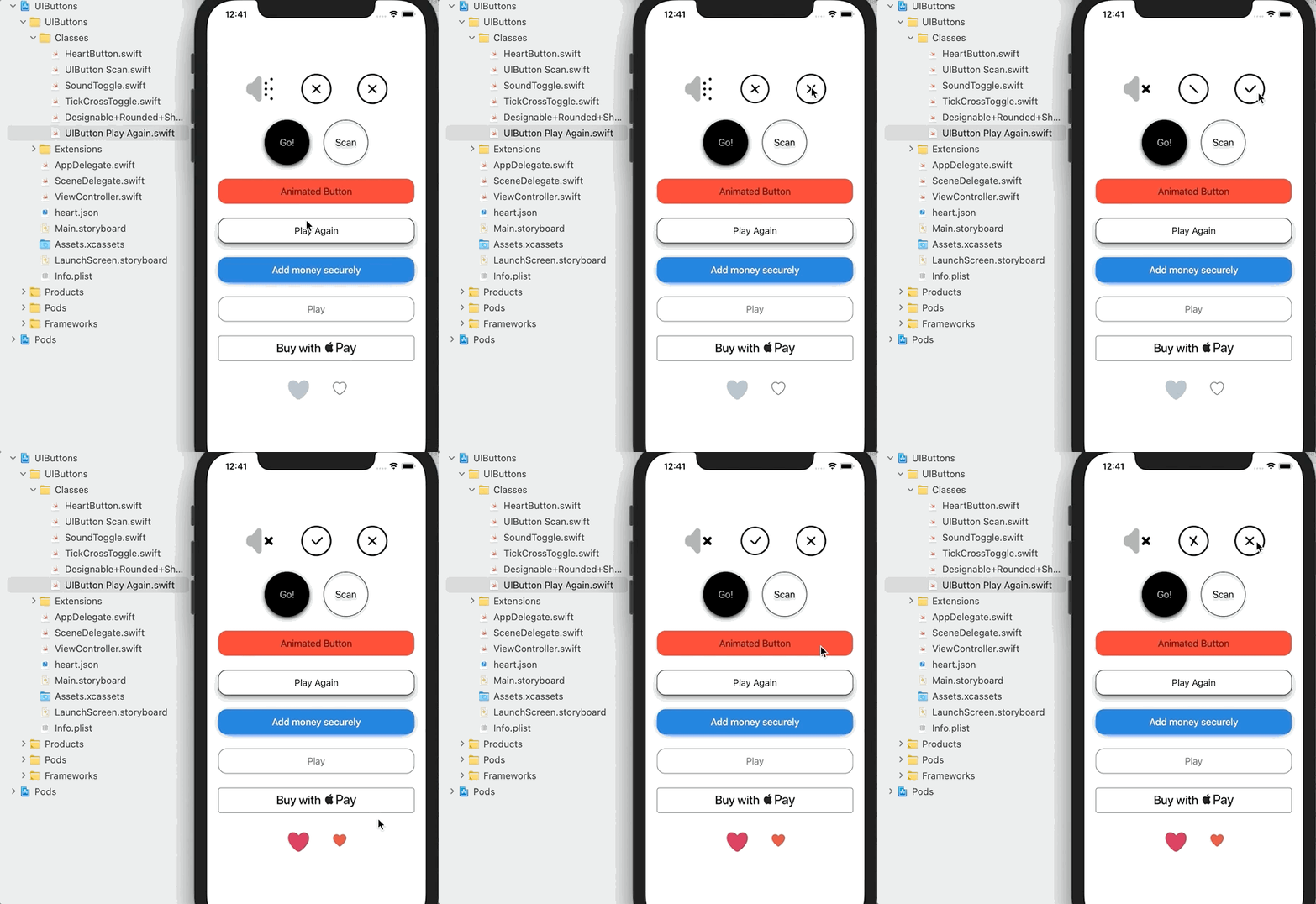
Starting with the Sound Toggle Button, this simple UIButton employs two images to represent its states. The implementation details are encapsulated in the SoundToggle.swift file, a standard subclass of UIButton that I learned about from Sean Allen. The images are stored in the standard assets folder, and the button's state is maintained using NSUserDefaults, ensuring the state persists even after app restarts. An extension is added to establish the initial state, which can also be integrated directly into the button's initializer, as seen in other button types. This setup occurs within the viewDidLoad method and necessitates an IBOutlet connection to the button.

The UIButton is positioned on the storyboard, and the custom class SoundToggle is selected in the identity inspector. Additionally, the button type is set to custom in the attributes inspector, allowing us to disable the standard highlight effect with the property adjustsImageWhenHighlighted = false. Although I believe this could be done programmatically, I haven't attempted it yet. You can observe this button in action in a couple of my applications, linked here and here.
Section 1.1: Animated Tick-Cross Button
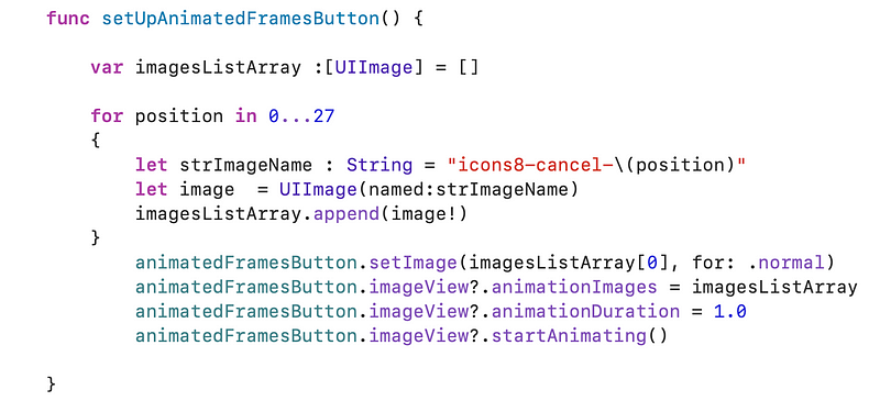
Creating the animated Tick-Cross button is straightforward; the most challenging part is sourcing animated images. I utilized Icons8 for GIFs, then employed a service to separate the frames into individual PNGs—27 in total to achieve the desired effect. Similar to previous examples, the button is sized and configured in the storyboard, with an IBOutlet established. For convenience, this functionality resides within the ViewController file and is called in the viewDidLoad method, with credit to StackOverflow.

Subsection 1.1.1: Clickable Tick-Cross Animation
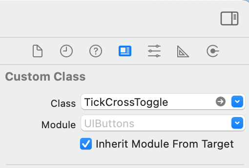
A variation of the animated button, this one toggles between tick and cross states with each click, accompanied by animation. The logic for this is contained in the TickCrossToggle.swift file, requiring the button to be set as custom and linked to the TickCrossToggle class.

Each state is represented by an array of images, so I implemented three arrays: one for all images, and two for the transitions between tick and cross states. I devised this logic, though I do not claim it’s flawless.
Chapter 2: Enhanced UIButtons with Designable Features
In the video "How to create Neumorphic buttons in SwiftUI," you will learn how to design buttons with a modern neumorphic style, enhancing your UI with depth and shadow effects.
Go! Circle Button with Shadow
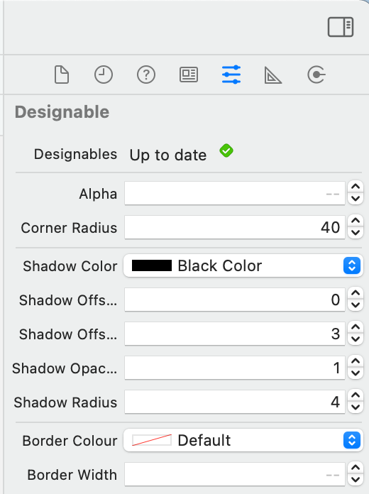
The Go! Circle button demonstrates the use of IBDesignable, allowing properties to be modified directly in the storyboard for real-time previews. Although I have reservations about the stability of IBDesignable, as it can be unpredictable, it proves useful. Similar to other examples, the button is set up in the storyboard, with the custom class linked to Designable. The code is located in Designable+Rounded+Shadow.swift, showcasing a pleasing shadow effect.

Subsection 2.1: Circle Button with Background Animation
This is one of my preferred UIButton designs. I appreciate how the border casts a shadow due to the transparent background. Most of the setup occurs in code within the UIButton Scan class, while I also leverage the attributes inspector to adjust the text color when highlighted. The circular shape is achieved by calculating the corner radius as half the button's width. The subtle background animation can be modified by changing the highlight duration.

Section 2.2: Animated Press Button
A simple animation using CGAffineTransform is implemented in the UIButton + AnimatePress.swift extension. The button is configured in the storyboard with an IBOutlet connection, and initialization occurs in viewDidLoad.

In the video "How to Add Fun and Dynamic Lottie Animations to Your iOS Project," discover how to incorporate engaging animations into your iOS app using Lottie.
Revolut Designable Button
This button is inspired by the Revolut banking app, which features attractive design elements. The shadow matches the button's blue hue, creating a cohesive appearance. The actual Revolut button subtly shifts to a different blue shade when pressed, while the text remains unchanged.

Apple Pay Button
If you've utilized Apple Pay, you're likely familiar with its button design. Developers are required to use Apple's specified buttons to avoid app rejection. Adding this button via storyboard is somewhat challenging, leading me to adopt a hybrid approach with both code and storyboard elements for alignment.
Lottie Twitter-like Button
Lottie, created by Airbnb's design team, utilizes JSON files for vector animations. This implementation marks my introduction to Lottie, and the results have been impressive. After installation via Cocoapods, you can access numerous free animations or create your own using Adobe After Effects. The buttons are created as UIViews, changing the class to AnimatedButton (module Lottie), allowing for dynamic animations.
Second Twitter Like Button
Employing CGAffineTransform, this button effectively animates state changes, almost rivaling the Lottie button in visual appeal. While I aimed to enlarge the demo button, I encountered some challenges. If implemented in production, I would encapsulate the button's tap handler within the class code rather than the ViewController.
Conclusion
Thank you for exploring my insights on crafting dynamic UIButtons in iOS. I hope you gained valuable knowledge. Feel free to share your thoughts in the comments. The entire project can be found on GitHub.