Engaging with 4D Data Visualization Using Kepler.gl
Written on
Chapter 1: Introduction to Kepler.gl
Kepler.gl stands out as a robust open-source tool developed by Uber in 2018, designed for geospatial analysis of extensive datasets. It serves as an excellent resource for data scientists aiming to delve into geospatial data exploration and analysis.
In this tutorial, I will provide a brief guide on how to prepare and visualize data across four dimensions: Latitude, Longitude, Height, and Time. For instance, the visualization below illustrates the progression of new confirmed COVID-19 cases over time in Germany.
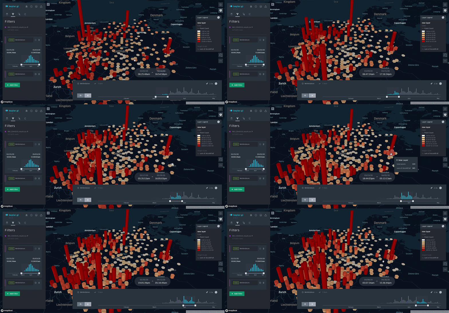
Chapter 2: Data Preparation Steps
To effectively map data on a 2D or 3D interface, it is essential to ensure that the dataset includes geospatial fields, specifically Latitude and Longitude. If the data originates from a geospatial format like shapefile or geojson, you can skip this step. However, if your data is structured in a table format lacking geospatial fields, you may utilize GIS software or scripts like Python with the Geocoder library. For example:
import geocoder g = geocoder.google('Stuttgart', key="<Your Google API Key>") print(g.latlng) # Output: [48.7758459, 9.1829321]
Alternatively, GeoPandas can also facilitate this process. Including a Date/Time column in your dataset is optional but beneficial for displaying timely data. For example, I sourced the German COVID-19 dataset from RKI, which was then prepared as shown below:

Chapter 3: Importing Your Dataset into Kepler.gl
Loading your dataset into Kepler.gl is a straightforward process. You can simply drag and drop your prepared dataset in formats like .csv, .json, or .geojson into the Kepler.gl application. If you prefer Python and Jupyter, you can conveniently load your dataset using Pandas before visualizing it in Kepler:
from keplergl import KeplerGl import pandas as pd
map = KeplerGl(height=500) df = pd.read_csv('<your dataset>') # Additional data manipulation with pandas can be done here map.add_data(data=<df_cleaned>, name='<data_name>')
Chapter 4: Configuring Your Kepler Map
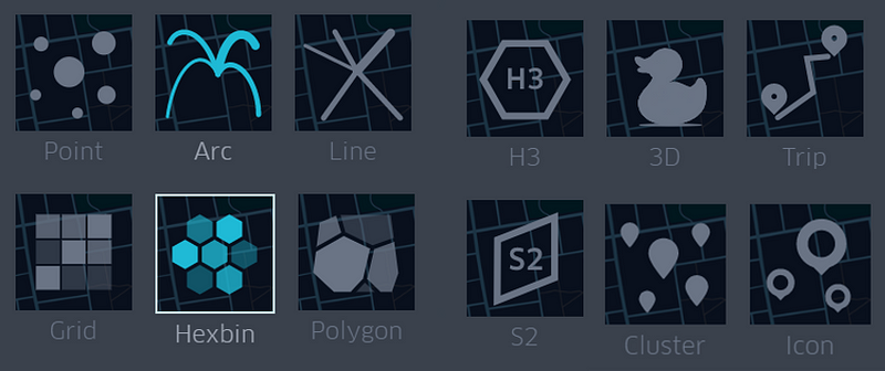
Now, let’s dive into customizing your Kepler map! Start by selecting the desired map type (the example above utilizes Hexbin).
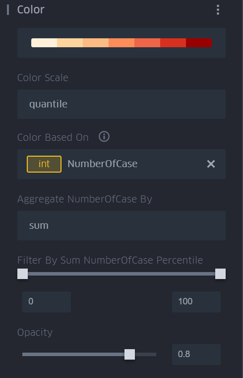
Define the Latitude and Longitude columns, assign a color theme, specify the scale and aggregation method for a selected column, and set filters and opacity.
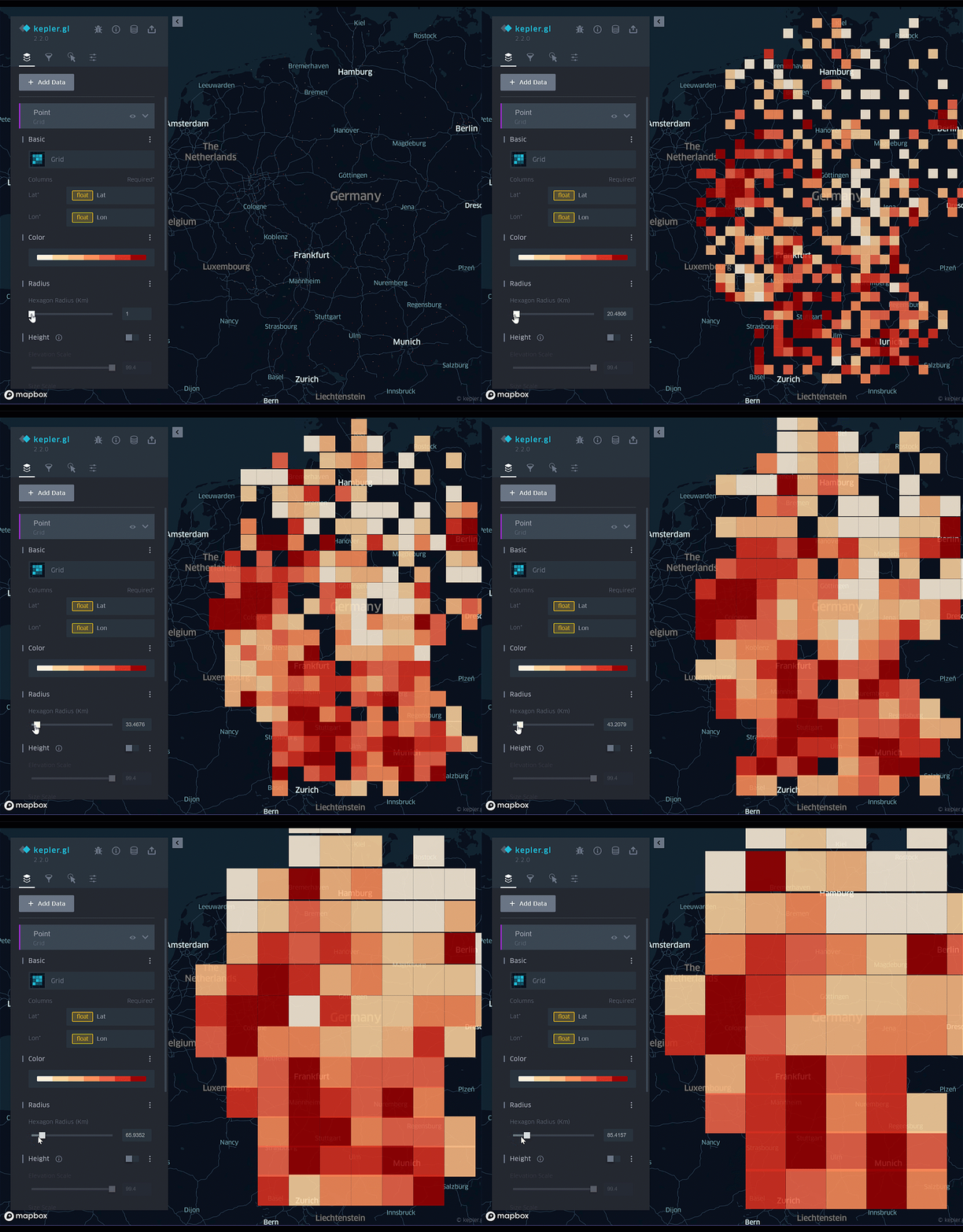
Adjust the grid size—Kepler will automatically aggregate the data based on your specifications!
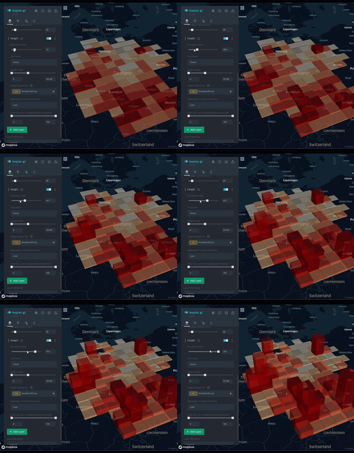
Enable height visualization based on the selected column. In this instance, I opted to aggregate the data by the total number of COVID-19 cases.
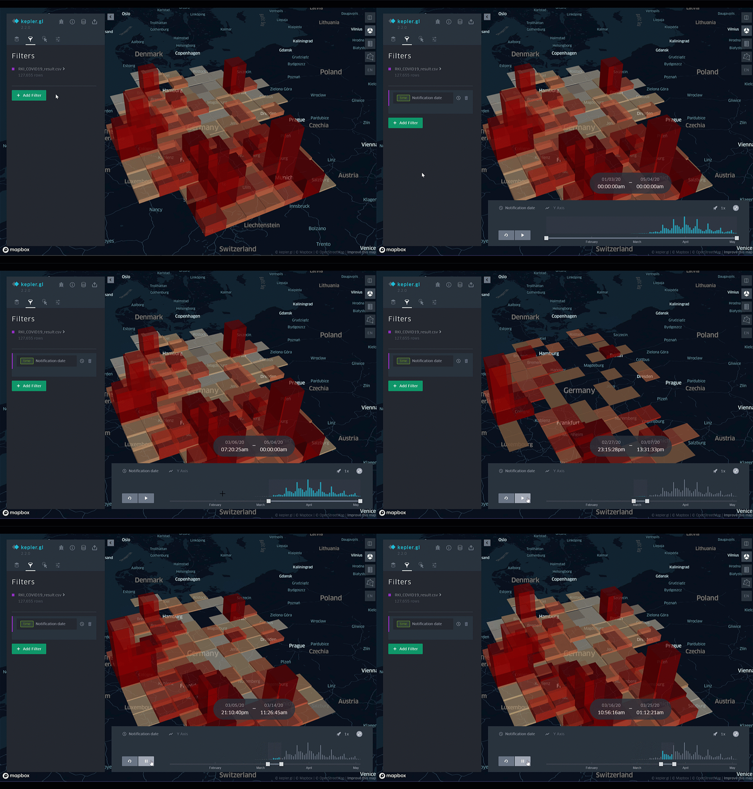
Lastly, activate temporal visualization by adding a layer filter and selecting the Date/Time column. This configuration allows for an animated map displaying COVID-19 case data by grid height over time.
Conclusion
About Me & Explore My Blog: [Link] Stay Safe and Healthy! Thank you for reading! 😊