Enhance Your Matplotlib Charts with These 3 Easy Steps
Written on
Introduction to Enhancing Matplotlib Charts
Matplotlib is known for its ability to create visually appealing plots. Here’s a straightforward demonstration using a basic bar chart.
Photo by Roman Kraft on Unsplash
While I have a fondness for Matplotlib, I recognize it can be polarizing. Many critiques label it as “dull,” “complicated,” or producing “unattractive charts.” My aim isn’t to sway you to love it, but rather to assist you in maximizing its potential for your own visualizations.
As you begin your Python journey, you’ll often use Pandas and Matplotlib for plotting. Initially, I found this process somewhat tedious due to the simplistic and uninspired appearance of the charts. However, I am thankful for mentors like Robert Ritz, who inspired me to explore Matplotlib’s extensive customization capabilities.
Matplotlib is a robust tool for creating customized charts. Today, we’ll focus on enhancing a basic plot made with Matplotlib through three straightforward steps. You are welcome to adapt the code snippets provided below for your own charts.
Libraries and Dataset
To get started, let’s import the necessary libraries.
I have selected the dataset titled “Restaurants Business Rankings 2020.” You can download it from Kaggle to follow along with the steps.
Let’s take a look at the initial lines of the dataset:

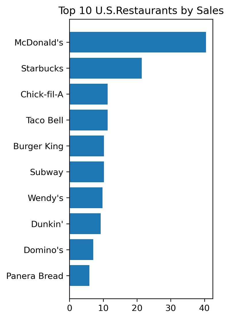
Our objective is to create an appealing chart showcasing the top 10 U.S. restaurants based on sales from this dataset.
Creating the Basic Chart with Matplotlib
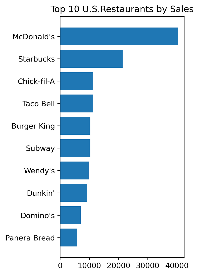
Let’s start with a basic horizontal bar chart to visualize the data:
Now, let’s explore how to enhance this plot.
Step 1: Eliminate the “Black Box”
To create a more airy feel for the chart, we can remove the black box surrounding it. This involves eliminating the unnecessary spines—specifically the top, bottom, and right spines. We can achieve this by using the set_visible function on the axes and making the left spine more prominent with the set_linewidth function.

Step 2: Introduce a Grid and Fine-Tune Tick Labels
The primary goal of any plot is to ensure it is easily interpretable by the audience. A well-designed grid can greatly assist in this.
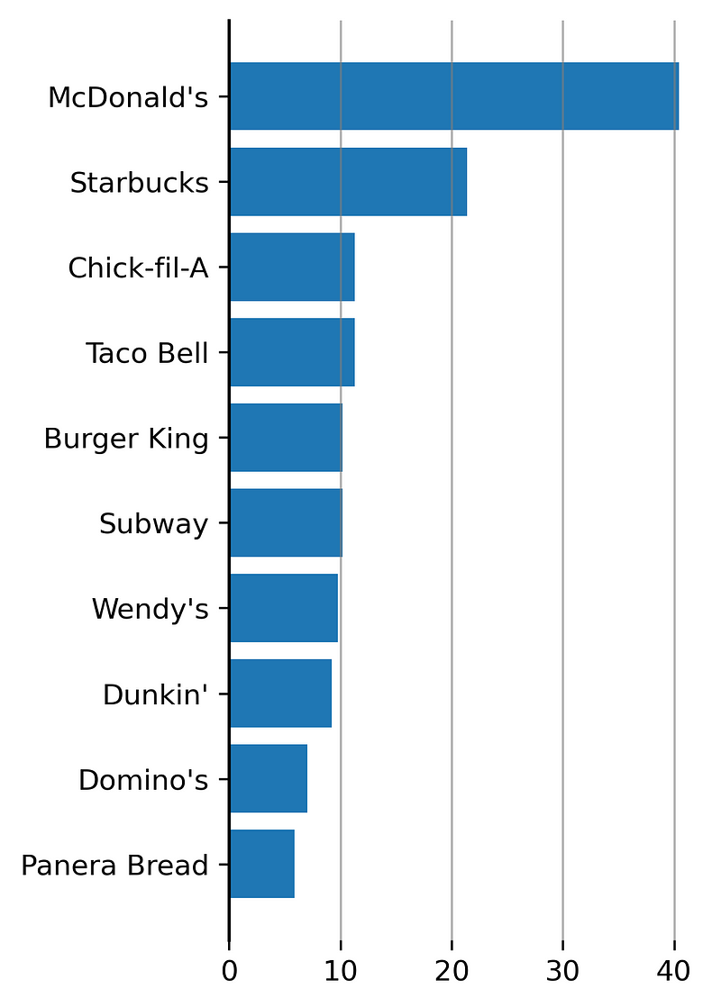
Currently, the thick gray grid lines overlap the bars, disrupting the overall aesthetic. This can be remedied by adjusting the alpha property to modify the opacity of the grid lines from 1 to 0.6. We can also ensure the bars are more prominent by setting zorder—1 for the grid and 2 for the bars.
Let’s refine our code with this adjustment:

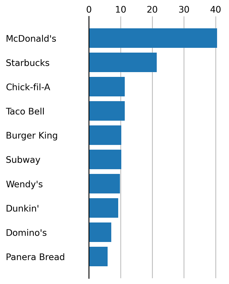
Next, let’s revisit the x-ticks and y-ticks. Positioning the x-ticks at the top and shifting the y-ticks slightly to the left can enhance readability. We’ll employ the set_tick_params function for these adjustments.
Step 3: Incorporate Text Elements (Title, Subtitle, Source)
In the final step, we will add textual elements to the plot using the text function. The critical aspect here is using transform = fig.transFigure, which allows you to position the text relative to the figure’s coordinates.
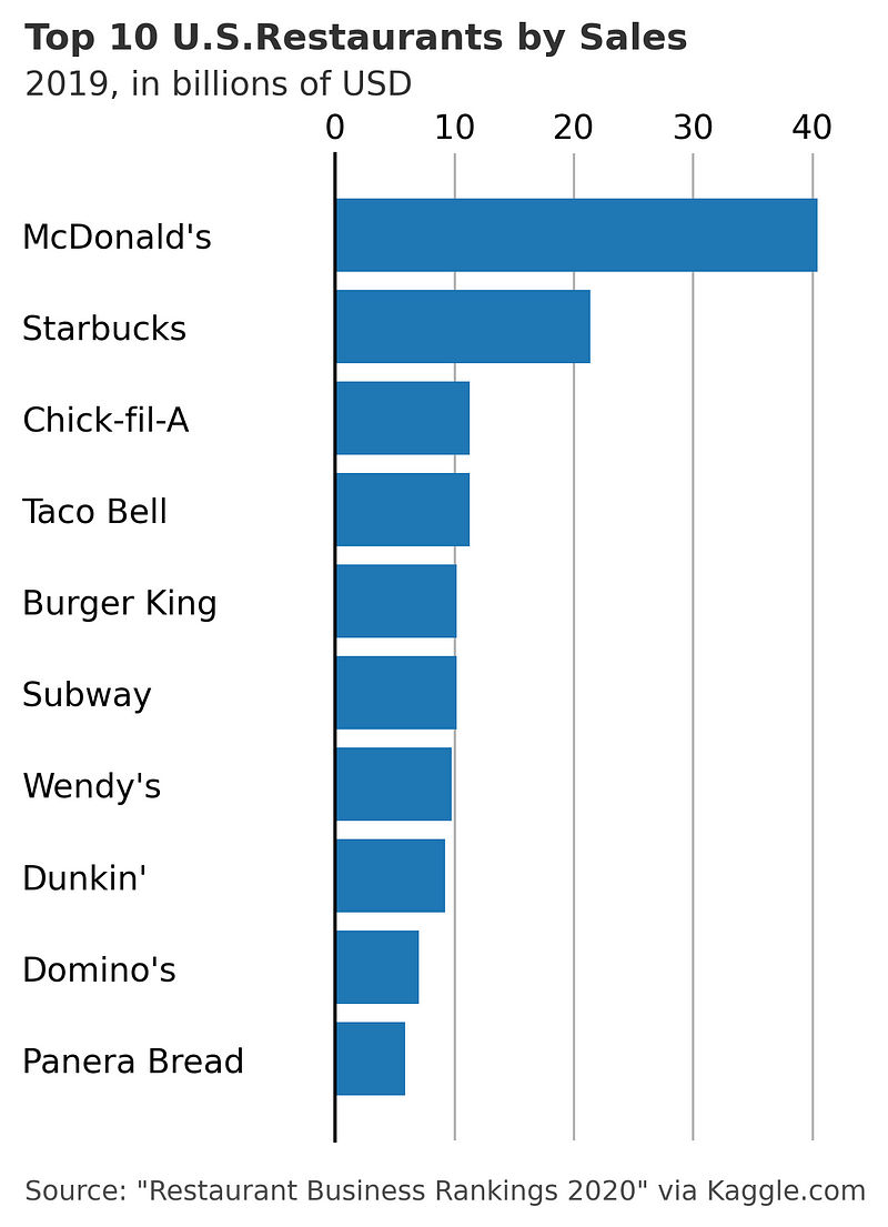
Here’s how the bar chart appears after implementing these three steps:
Conclusion
I trust this step-by-step guide will assist you in enhancing your Matplotlib charts. There are numerous possibilities for further improvement, and these three steps provide a solid foundation.
Thank you for your time! Consider subscribing for updates on my future publications. You can also connect with me on LinkedIn.
References:
- Tutorials — Matplotlib 3.5.2 documentation
- More content at PlainEnglish.io. Sign up for our free weekly newsletter. Follow us on Twitter and LinkedIn. Join our Community Discord and Talent Collective.
Matplotlib Tutorial (Part 1): Creating and Customizing Our First Plots
In this introductory video, you will learn how to create and customize your first plots using Matplotlib, setting a solid foundation for data visualization.
Advanced Plotting Techniques in Python
This video dives deeper into advanced plotting techniques with Python, showcasing how to create visually appealing figures using Matplotlib.